
By Ted McIntyre
10 Dazzling designs that allow the architecture to sing
Artists don’t like you cutting part of their canvas off in the middle of a painting, nor do writers take kindly to their stories being arbitrarily edited.
And so it is with residential architects who, given a particular set of parameters at the outset, envision a creative melding of materials, landscape and client requirements. Builders and developers, on the other hand, are constantly constrained by time and space. And the reality is that budgets and municipal building codes can alter course in midflight. And, of course, clients can always change their minds.
But sometimes the artistic spirit is allowed to truly breathe, and the puzzle pieces come together in a particularly inspired way.
An early meeting of the minds helps to make those memorable creations more common occurrences, explains SMPL Design Studio’s CEO and Creative Director Joel Tanner. “Over the past few years, we’ve seen an increase in partnerships with builders who are on board very early in the design stages,” Tanner says. “We set the tone and parameters ahead of time. For example, both we and the builder are saying $600 a square foot and that we’re both here to guide the process, so that when we put a shovel in the ground, the clients are happy that you’re on budget and we’re not having to modify the design last-minute. The old-school approach was that the builder would have to come in and replace natural quarry-cut stone with manufactured stone, get rid of ACM panels and use stucco in its place, and forego aluminum windows for vinyl. And then I’m left thinking, ‘This doesn’t look anything like what I’ve drawn!’
“I think the sector is getting away from that,” Tanner continues. “The architects and designers are very sensitive to what they’re putting on the planet. And the builders care about it because it’s their name on it for the next 50 or 100 years. And the client doesn’t want their project to look like they cut every corner to make it happen. So it’s nice to have this newer bond between designer, builder and client for a better, more long-term result.”
What follows are 10 Ontario projects of varying shapes and sizes completed in the past few years, each of which allowed the architectural firm to spread its collective creative wings.
Project: Big Rideau Lakehouse (Perth)
Company: Christopher Simmonds Architect
Builder: Riley Construction

Side Elevation

Back View
Appeasing the conservation authority, including a 100-foot setback from the water was one thing, but satisfying all the involved clients was where architect Christopher Simmonds’ creativity shone most with this 4,220 sq. ft. multi-generational, four-season cottage on Big Rideau Lake in Perth.
“The original cottage had been there about 30 years,” recalls Simmonds. “The older generation wanted something more warm and homey, while the younger generation were keen on something more modern. So we had to walk a fine line.”
To help blend the rural character of the area’s older cottages while providing a clean, modern environment that engages the landscape, the cottage was built into the hillside, presenting itself as a modest one-storey gable. The approach leads visitors past a fully glazed wall offering a glimpse through the building and the lake views beyond.
Moving towards the lake, Jason Smalley Landscape Design made the most of Simmonds’ plans, with a generous stone terrace that is lowered to allow unimpeded lake views from the living and dining room, as terraced limestone planting beds wrap around the side of the lake house.
The requirement for a large screen porch area with a direct connection to the interior was a defining element for the project. Multi-slide pocket doors create a 15’ opening, extending the living spaces onto the porch. Perched on thin, circular columns, this “room in the trees” hovers above a terrace that extends from the walk-out level below.
The interior is designed to enhance natural light with white walls and ceilings and white oak flooring. “The white tongue-and-groove planking was one of the things that really make this project,” Simmonds says. “It adds a wonderful warmth and texture.”
Black accents provide a bold counter punch, while charcoal-grey siding complements the zinc-coloured metal roof.
But unimpeded views to the water and dock were also required. “I was delighted with the way the sightlines worked out,” Simmonds says. “It really ties you to the property.”
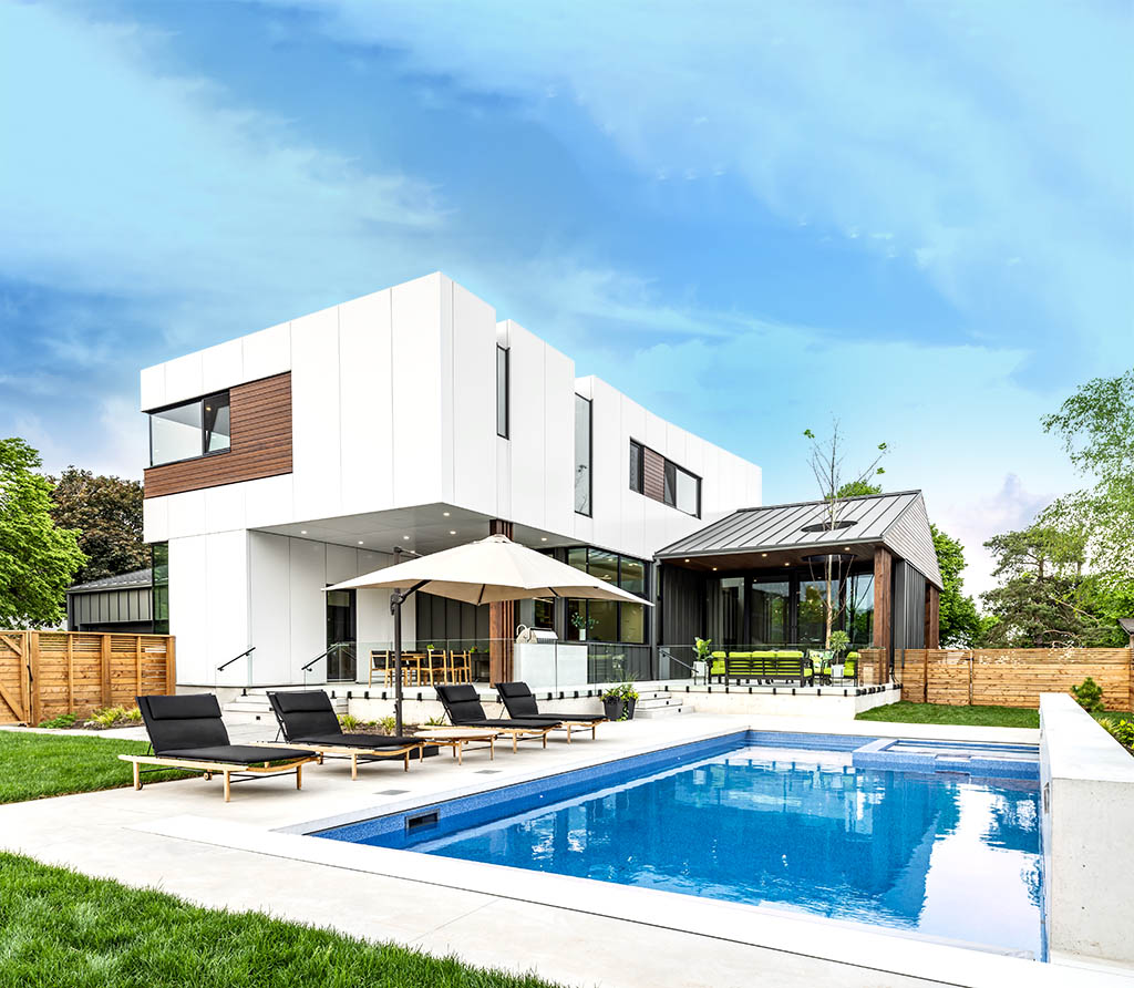
PROJECT: THE LAST HOUSE (Mississauga)
Company: David Small Designs
Builder: Profile Custom Homes

 From an architectural standpoint, “the home is the epitome of visual clarity—structural beams on display, intense use of glass, raw and exposed concrete,” notes David Small, whose firm of David Small Designs oversaw both the architectural and interior designs of The Last House, completed in 2019.
This 3,800 sq. ft. Mississauga home features a driveway “carved out of the heavily wooded landscape on the far-right side of the property,” Small highlights. “As you approach, slowly the home reveals itself. The interesting mix of materials and varying roof designs come into focus. The prominent glass bridge is clearly defined. The bold front door pops. The incredible backdrop of mature, lush trees is fully appreciated. Then you realize, you can see the pool from the driveway. The indoor-outdoor connection is all-consuming.”
Designed to be the homeowners’ final home, the barrier-free layout includes an elevator, solar panels, a green wall near the entrance, a woodburning fireplace, a year-round pool/spa combination and a five-car garage that doesn’t overpower or detract from the beautiful, modern facade.
Small’s biggest challenge was blending the architectural vision (maximizing the visual and physical connection between interior and exterior spaces) with the construction and technology requirements (structure, HVAC, window coverings, energy consumption, etc.) in a manner that reinforces the overall concept with boldness and clarity.
The most satisfying element is indoor-outdoor connection; “the overall sense that the home is ‘participating’ in the landscape rather than dominating it,” Small says. “Elements such as the wide but thin, upward-sloping overhangs provide a feeling of lightness. The intense transparency—clearly seeing the front yard from the back and vice versa—tend to make the home disappear. Everything about the house is a celebration of the property.”
Project: 574 MOUNTAIN BROW (Hamilton)
Company: SMPL DESIGN STUDIO
Builder: DB Custom Homes
Following a complete teardown of the pre-existing 1950s home, SMPL, working with builder DB Custom Homes, crafted a 3,600 sq. ft. modern home on Hamilton’s mountain brow, the Scandinavian design of which was informed by the clients’ European background.
“The 10’ basement ceiling elevated the main floor assembly, which allowed for a better view overlooking the mountain brow to Lake Ontario and Toronto,” Tanner notes. “The sloped-roof assembly facing toward the mountain brow helps hug the building envelope to the ground.
“Super-insulated and built with über-robust materials,” savvy design and strategic use of glass ensures that every room features a strong connection to the outdoors, whether out the rear or side yard to the pool, to the fire pit or to the front entry.
An eye-catching detail is the Bloodgood London Planetree that stretches through a hole in the roof. “We put the foundation in, landed the tree and built the house around it,” Tanner says.
“Our favourite element, though, is the front corner windows in living room and office. It allows the architecture to seemingly defy gravity, because you have a significant roof overhang overtop those glazing details, with no support posts on the corners—just a glass-to-glass connection. It really brought the project to another level for us.”
Company: Drew Mandel Architects
Project: Ballantrae Country House (Whitchurch-Stouffville)
Builder: MDK Construction

doublespace photography

doublespace photography
Located in Whitchurch-Stouffville, this project’s inspiration arose from the existing watercourse and landscape—a swath of sloping land within the jurisdiction of the Lake Simcoe Conservation Authority, with a connection to a protected woodland habitat.
“Much of our residential work involves infill work within established neighbourhoods, so this vacant rural site represented a relatively novel opportunity for our office to locate a structure on a significant property,” offers Mandel, the firm’s principal. “Located on a high and flat ridge at the north-most boundary of the property, the long face of the building is able to open up to the expansive, sloping landscape,” Mandel adds. “Through the floor-to-ceiling windows, the winter snow, autumn leaves, summer greenery and spring blossoms become part of the home.”
One key client request for the multi-generational vacation home was for no steps to ensure ease of use by both very young and older family members. “So rather than step to follow the topography, the building is designed as a simple horizontal circulation corridor, connecting masses that reach out into the landscape,” Mandel describes. “Amplified by ceiling height, these edges create a variety of different spatial experiences that connect the interior to the landscape. The rectilinear and horizontal house acts as a foil to the natural sloping landscape, as at-grade access at the front of the house becomes eye-level views of the tree canopies at the rear. The building measures itself against the indefiniteness of the site.”
A material palette of natural materials complement the surroundings, including handmade brick, fumed ash cladding, oak interior finishes, a green roof and plenty of natural light. To restrict solar heat gain on the south-facing windows, vertical fins act as sun deflectors.
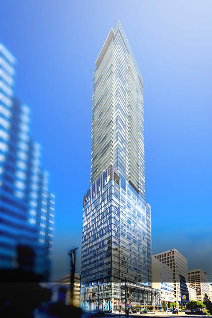
Project: Massey Tower (Toronto)
Company: Hariri Pontarini Architects
Builder: MOD Developments

Photography By Andrew Wong
The design of the 60-storey, mixed-use Massey Tower makes inventive use of a small site containing the historic Canadian Bank of Commerce building—a site further constrained by the donation of land to the legendary concert venue (and namesake of the development) Massey Hall at the property’s northeastern edge. Working that tight downtown site, surrounded by historic theatres and performance halls, next to one of Toronto’s busiest streets, meant ”playing a complicated logistical chess game” for contractor Tucker HiRise Construction, notes Hariri Pontarini partner David Pontarini.
The project included refreshing the facade and preserving the interior plaster mouldings and circular mosaic floor of the bank. Working with MOD Developments and heritage architect ERA, Hariri Pontarini incorporated the bank into the base of the building, which now provides the primary entry.
“The constricted block structure, easements and awkward footprint also required the use of an innovative automated parking structure for residents—using a vehicle elevator instead of ramps—sandwiched between the heritage and retail base and the underside of the tower,” explains Pontarini. Deviating from a typical box-like design, meanwhile, the tower’s upper floors are angled to accommodate the helicopter flight path of nearby St. Michael’s Hospital.
Pontarini says the expression of the balcony form and its contribution to the skyline are among the most pleasing aspects of the project. “The tower plan comprises two alternating balcony types, with diagonal bands in opposite directions of each opposing plate. This creates a billowing shroud (patterned in fritted glass) that weaves its way down and across the building to control and order an aggregate of programmatic elements, rather than a layer cake of parts (retail, lobbies, car parking, mechanical floors, amenities, residential floors). This singular language created by the shroud had the added effect of providing a unique but neutral backdrop to highlight the heritage components of our site and the adjacent buildings.”
Project: 488 University (Toronto)
Company: Core Architects
Builder: Amexon Development
While the project, guided by lead architect and Core principal Deni Poletti, included major enhancements to an existing 18-storey office building (Global House) built in 1968, the true design marvel was the 37-storey, 453-unit residential tower fashioned atop Global House. “The new structure is supported independently from the existing building by a steel exoskeleton around the perimeter, plus two extensive shear walls located within abandoned vertical mechanical shafts,” explains Walsh. “Four additional below-grade parking levels were also added in a top-down construction process—all of which was done with the existing office building fully occupied!
“Although there were many challenges, one of the most significant was the coordination of the steel structure to the existing concrete structure. No new vertical loads could be transferred to the existing structure,” Walsh says. “The ground floor also presented its own set of difficulties, as much of it had to be carved away to allow for the new programmatic uses.”
But there was also an aspect that turned out even better than initially planned. “The location of the sky lobby and the shared residential/commercial amenities were in part a by-product of the remaining mechanical and elevator overrun space between the residential transfer slab and office tower roof,” Walsh says. “Ceiling heights are quite dramatic and the views from that level are unparalleled.”
Project: FA2 House (Toronto)
Company: Urbanscape Architects
Builder: Urbanline
 In residential architecture, renovations and additions are about respecting the existing structures while creating new opportunities in space for a growing and changing lifestyle. FA2 House continues the story of an existing side-split structure with a dramatic transformation.
Regulations regarding building next to a ravine prevented the complete demolition of the existing structure. So in order to increase the square footage of the new home, while working within the existing footprint, the new design cantilevers over the ravine, integrating with its adjacent landscape.
Using steel in the new structure provided the necessary stability to open up the living spaces and cantilevering addition. The new kitchen, dining and living rooms have been configured to not only seamlessly connect but to also allow for that overhanging extension into the ravine.
The three-storey atrium at the centre, meanwhile, was designed to allow for the penetration of sunlight from the front of the house into various levels and provides great visual communication from all the levels. For example, the second-floor office overlooks the kitchen, and from the kitchen you can see through to the basement.
Leveraging the side-split concept, the new appearance of the house also connects the garage—complete with an automobile workshop—to show off the owner’s race car and motorcycle collection by the way of a glazed wall.
Company: Kariouk Architects
Project: Dash (Ottawa)
Builder: GPL Construction
 Call it “Geometree”—the ability to take an unusual lot and fashion a unique design that meshes seemingly incompatible curves and angles, with a final result that provides striking treetop sightlines.
“It was an odd diamond-shaped site. But we just manipulated the geometries to fit it into this restrictive envelope,” relates Paul duBellet Kariouk, founder of Kariouk Architects.
While many homeowners in the 1960s Ottawa neighbourhood built mansions where quaint homes had once stood, Kariouk and client found a way to be less obtrusive, while also not disturbing the well-treed environment as a standard ground-up design would have.
“The client thought about how every penny was going to be spent. It wasn’t just a piece of sculpture that they coughed up a lot of money for,” Kariouk explains of the 2,800 sq. ft. home. “Visually, it’s different, but with the cantilever, the neighbours can look under that portion and not feel boxed in.”
An acronym for each family member’s first name, DASH claimed Best Custom Urban Home (3,000 SF or less) at last year’s Greater Ottawa Home Builders’ Association Housing Design Awards. Designed to accommodate both the current lifestyle of a young family and the future needs of the parents as eventual seniors, it includes a caretaker suite (to be completed if ever needed) and an elevator shaft.
“Originally it was just the garage on the ground and bar on top,” Kariouk notes. “But halfway through the design process, the zoning changed and we had to shorten the bar—but that’s where the ‘egg’ developed.”
That oval volume contains bedrooms and a study, while the long rectangular volume holds the kitchen, living/dining areas and a master bedroom suite. Being elevated, all the primary areas of the home have significant privacy, even with nearby neighbours.
Where the two volumes came together was a special focus for Kariouk, resulting in the spectacular ‘Sky Stair’ oculus feature at the heart of the home.
Project: Wrap House (Etobicoke)
Company: Kohn Shnier Architects
Builder: DSBG Construction Management
 When an architect hires another architect to design her house, something memorable is bound to follow. Such was the case with Wrap House, a wholesale reimagination of an existing 1980s side-split into a new single-family home designed for healthy, multi-generational living.
“We were asked to keep the existing house and create a balance of intimate and private spaces, while striving for openness and facilitating views that maintained contact between her and her family members,” notes Kohn Shnier partner John Shnier of the imaginative 4,000 sq. ft. Etobicoke project.
While the new house remains a modest neighbour, its handsome, contemporary facade conceals a fanciful interior. “Like an art gallery, the space is meant to avoid creating the typical divisions between private and public zones of living,” Shnier indicates. “Friends and guests are able to flow through the house on every level. Beds, dressing areas and other typical program elements are located off from views into the bedrooms, thus allowing doors to be left open most of the time.”
A skylight situated high above the dining area tapers and contours through a rift in the ceiling plane into a shape Shnier describes as a “soft spatial wedge.” Its form and location bring light into the centre of the house. “But mainly it creates a subtle but effective interruption in the low, flat ceiling,” he says.
 “The ceilings themselves are inflected through coves, floating edges and strategically formed curves,” Shnier adds. “This, along with the reflective and translucent surfaces, results in a playful collection of whimsical spaces whose exact resolutions mischievously avoid full understanding. There are also several slots and sneaky peaking views and overlooks, where glimpses can be had of kids as they’re playing their instruments, flashes of colour from the beautiful contemporary furniture in the home and the reflections that create phantom spaces and double-take moments.”
Project: ENIGMA IN THE PARK (Toronto)
Company: BDP Quadrangle
Builder: Aragon Properties

doublespace photography
While it borders on an urban greenspace, this mixed-use project, featuring artist studios, galleries and 90 residential units, has infused new energy, renewal and growth into a previously contaminated site adjacent to a rail corridor in Toronto’s Bloordale neighbourhood.

doublespace photography
Working with RAW Design, Quadrangle principal Richard Witt and project architect Harim Labuschagne conceived of a striking exterior, the diagonal pattern and design of which would help reduce the project’s impact on nearby homes.
“Sometimes when people look at a project, they think there’s contrast for the sake of contrast. But the driver of the (chevron) expression had much more to do with the relationship to the low-rise residential area to the east,” Witt observes. “We pushed the building as far away as we could to the west against the rail setback. And we also terraced the building, so that it wasn’t a big straight-up form. And if you look at it without already knowing what you’re seeing, the diagonal pattern creates a perspective that reduces the scale of the building. Even though it’s nine storeys—five on a four-storey podium—the scale is reduced by a sense of undulation. So the boldness of the expression is actually in contrast to its effect!”
An attractive L-shaped courtyard centres Enigma, with a bridge connecting the buildings. “The floor space index—the amount of density as it relates to the site—is only 2.73, whereas other comparable midrise projects we had at the same time were achieving almost twice that,” Witt notes. “So that enabled us to make the ground plane something really special. We really concentrated on the way it connects through the park across to the residential neighbourhood. It’s an exciting space because of the facade and the unexpected sense of how grand it feels. Then at the corner it opens up to the park. It’s quite dramatic.”
Become a member of the Ontario Home Builders’ Association.